
Cat How, Founder & ECD at How Studio, takes us through how their rebrand for energy services provider Hometree saw us redefine their verbal, and visual identity as well as website; with a brand idea ‘Transition Companion’, that showcased the company as the calm and reassuring partner that empowers a homeowner’s journey towards a more positive future for our planet.
What was the brief for the rebrand?
Hometree is a residential energy services company whose aim is to help millions of UK homeowners transition to lower carbon living when the time is right for them.
Hometree came to us with a range of new services that help homeowners navigate the complex home energy landscape. They also needed new branding to reflect their future-focused business mission: to make the transition to net zero homes less stressful and more affordable.
How did the initial pitch/brainstorming phase go?
Well! It was a pitch alongside about 8 other agencies - and we won it!
Describe the purpose of the brand and its target audience
14% of the UK’s greenhouse gas emissions come from heating. It’s the biggest contributor to a person’s carbon footprint over a lifetime. Yet homeowners are often left bewildered by what they should do to cut emissions, whilst also keeping their home running smoothly and affordably.
It’s time for home services to move on. At the forefront of that change was our client - Hometree - a homeowner’s end-to-end companion throughout this period of transition.
What was your thinking behind the rebranding solution?
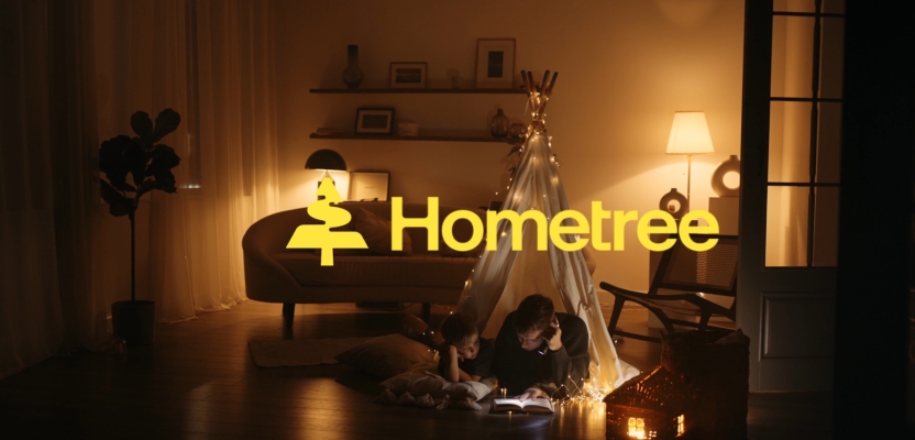
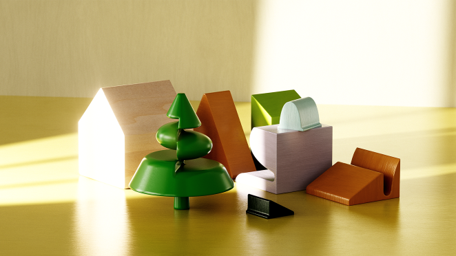
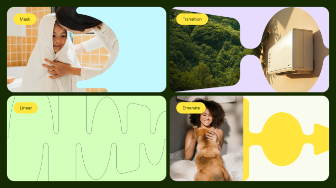
We created a logo-come-interactive assistant, Maple, whose animated movements prompt different home services actions, guiding customers to take tangible steps towards a brighter future in energy transition.
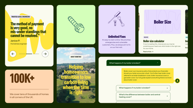
We combined the vibrant positivity of energy and progress through our energised logo and paired this with the comforting glow of a warm family home.
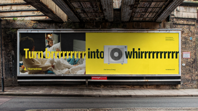
Art direction paired candid imagery with energy efficient hardware in cosy home scenes and personable service providers. A colour palette of yellows and greens completes the visual identity that feels warm, relatable, natural and environmental.
Did you learn anything new during the project?
We always learn something new from every project! This one was about how refreshing it is when a client is as keen on the details as our design team, it meant we were both striving together to produce the best work possible.
![]()
Hats off to you, Natasha Berthiaume (Head of Brand, Hometree).
What was the biggest challenge? How did you overcome it?
It was probably coming up with Maple’s ‘behaviours’ and giving personality to what could be a very static logo.
What kit/tools/software were used to create it?
We used Figma, Photoshop, Illustrator, Redshift 3D, Midjourney.
What details are you most proud of any why?
Maple - the transition companion - which is a pure embodiment of the brand idea.
What visual influences fuelled your solution?
We were inspired by boiler circuitry, heat waves and pulsating patterns.
What do you hope it achieves for the brand?
We hope this rebrand makes them distinctive amongst their competitors, and memorable to their customers.
We hope that with this engaging narrative, ownable logo-come-mascot and optimistic palette and design system - the Hometree team will have all the tools they need to supersede their ambitions as a company as well as help achieve net zero for the planet.
What would you do differently if you could do it over again?
One thing we would love to do in the future is have our own photoshoot based around the brand - just to add to our bank of imagery to go alongside the company and have some more ownable assets.
Credit list for the work?
Carl Doneza - Junior Designer Cat How - Founder & Exec. Creative Director Christian Beck - Associate Creative Director Clare Beagley - Senior Producer Fanny Kaminski - Senior Creative Producer Hannah Leggett- Senior Digital Designer Harriet Stallibrass - Senior Copywriter Jack Wimmer - Head of Strategy Joana Fatela - Motion Designer Lucy McGinley - Senior Designer Luke Scott - Design Director.